
Recently, I handled this webinar on “The Art of Presentation Design” for a 500+ strong business community. I was a part of it when I was back home in India, and also part of the first training batch it had way back in 2013.
Since not everyone could make it to the webinar and it wasn’t open to an external audience, I thought it would add more value to share the presentation along with my further thoughts.
Introduction
Presentation design is definitely an art in itself. As much as it is a skill to conquer your stage fright and speak on stage, it is also a skill to be able to design intriguing and capturing presentations.
And no, you don’t need to be a designer to be able to design great presentations. All it takes are a few basic pointers to remember, and you are good to go.
As with all presentations I take, I focus on communicating three major learnings. In this case, the 3 areas I intend to focus on are:
- Key aspects of presentation design
- Design Styles
- Mistakes to avoid
In no way is this an exhaustive list. There are a million other points that could be covered, but when it comes to sticking to the bare basics, I believe these would do.
Key aspects of presentation design
1. Storyline
It is very important to have a storyline while planning your presentation. No matter what the topic, ensure there is a clear flow of ideas from one slide to the other.
See below an example. This is from a 10 slide presentation used as an investor pitch. Look at the flow of topics.
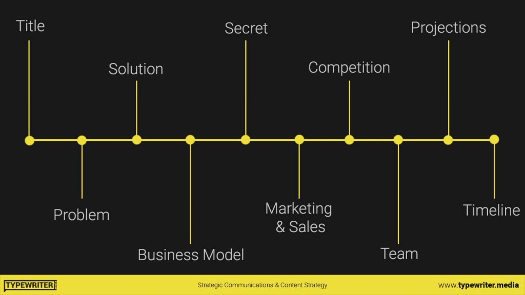
The flow of information is:
- Title
- Problem
- Solution
- Business Model
- Secret (The business’ USP)
- Marketing & Sales
- Competition
- Team
- Projections
- Timeline
You can clearly understand that for a business that’s doing an investor pitch, there is a clear storyline path here. Starting from the problem, the solution they are bringing in, how they are making a business of this, other business aspects, and then closing with timeline going forward.
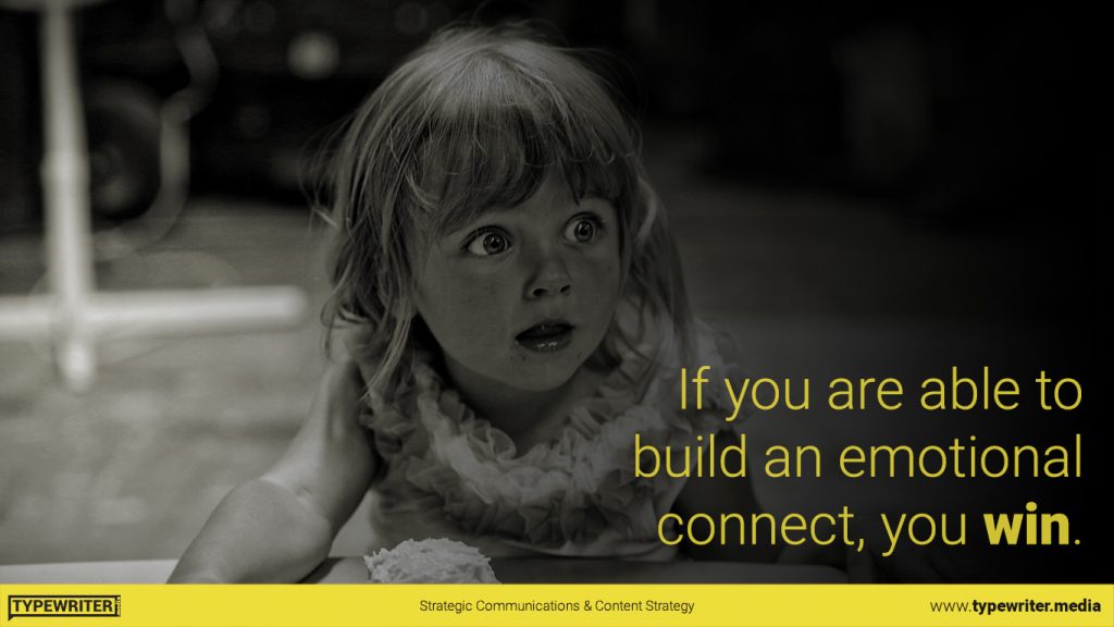
2. Emotion
No matter what you are presenting, it has to be with emotion. It has to convey emotion and connect with the audience, emotionally.
Shock, surprise, heart-warming, inspiring, anger – whatever emotion you can get your audience to feel, use it to your advantage. As humans, we love stories and we react to emotions. If you have already included storytelling into your presentation, then getting your audience to connect emotionally is the next major ingredient.
[bctt tweet=”For the success of any presentation, there are two major ingredients – story and emotion. Create a story around whatever it is that you are presenting and connect emotionally with your audience. If you are able to do these, you have already made it a great presentation.” username=”TypewriterMedia”]
Remember, if you are able to build an emotional connection with your audience, you have already won.
3. Message
Make sure all your slides talk around your key messaging and/or connect back to it one way or the other.
It’s easy to include unrelated stuff which might excite a laugh from the audience. But at the end of the day, if it doesn’t connect back to your key message, there’s not much value addition.
Also, tune your whole presentation around one key message instead of trying to cover a lot of topics. This makes it easier for your audience to grasp what you are sharing and also keeps your efforts efficient.
4. Design
Have a consistent design standard around your whole slide pack. Some basic pointers to remember:
- If its a brand presentation, stick to the colours of your brand.
- Try not to use a lot of colours. The more subtle it is, the better. Stick to preferable a maximum of 5 colours.
- Keep it clutter-free.
- Do not write paragraphs. Keep it short.
- Make it readable.
- Have a strong contrast between background and text.
- Use relevant visuals to increase appeal.
5. Consistency
Maintain consistency in everything. Be it colours, font, font size, tone, etc.
The worst presentations I have seen are the ones where literally every slide has a different font! Not kidding.
6. Simplicity
This one’s simple. Pun intended.
Whatever idea/information you are trying to convey through your presentation, keep it as simple as possible.
And, maintain this simplicity not just in the portrayal of your ideas but also in the content you put on your slides.
Design styles in presentation
Based on what needs to be communicated, I primarily follow 3 presentation design styles.
1. Takahashi + Lessig Style
This is a combination of two styles – the Takahashi style and the Lessig style.
The Takahashi style focuses on big texts, with no pictures or visuals.
The Lessig style focuses on conveying one idea per slide. While this leads to more number of slides, since there is only one idea per slide, the transition is faster.
For my presentation above, I have used a combination of these two styles.
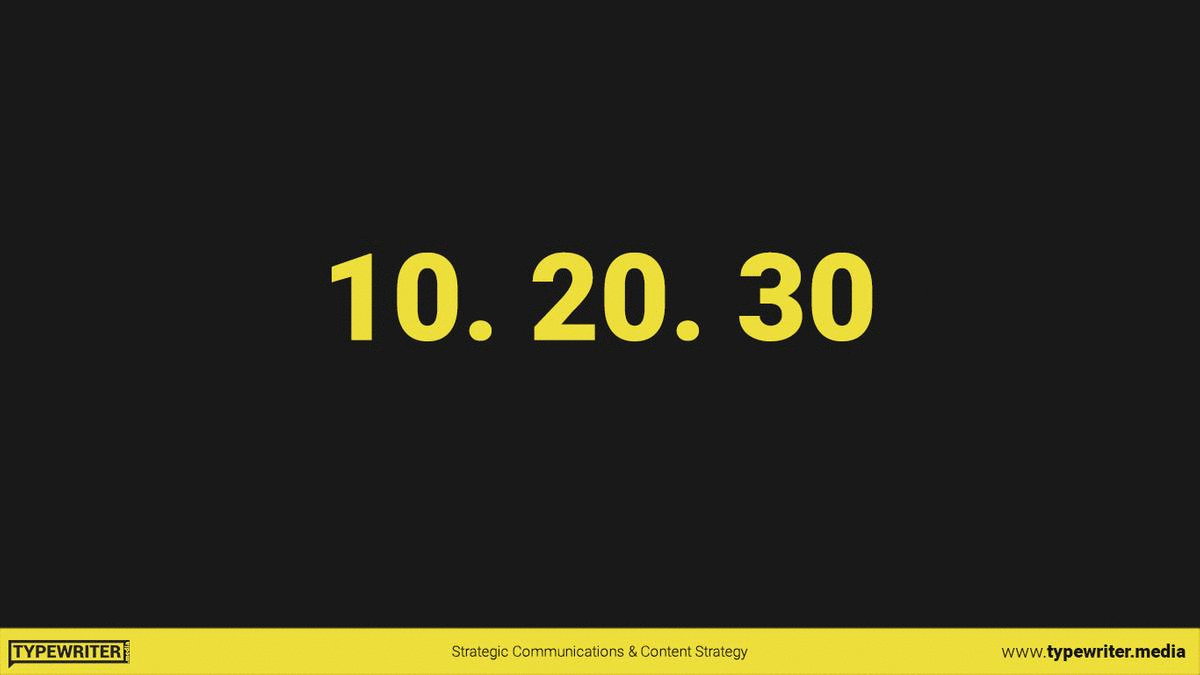
2. Kawasaki’s 10.20.30
Guy Kawasaki’s 10.20.30 rule works best for pitches and when you’re trying to get the audience’s approval for something.
10 slides.
20 minutes.
30 point font.
That’s all he says. According to Guy, 10 slides (10 concepts) are the maximum a regular human can grasp in one go. 20 minutes is the maximum duration for which they can concentrate on one thing. And a minimum of 30 pt font size because no one wants to read sentences from a presentation.
Mistakes to avoid in presentation design
While I have covered the basics of what needs to be done, I’ll also cover a few points on what not to do. After all, the human mind remembers better when it’s told NOT to do something. Am I right?
1. Wrong Fonts
Never use weird fonts that are too difficult to read. For example,
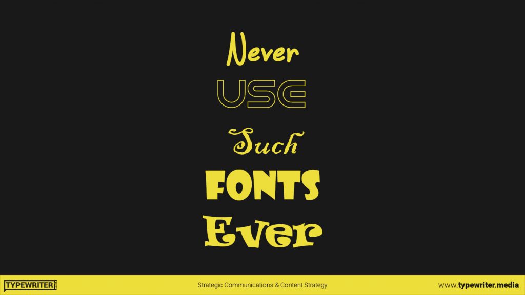
Try sticking with the very basic serif or sans-serif fonts. Some fonts I would recommend are:
- Helvetica
- Roboto
- Garamond
- Futura
- Rockwell
- Gill Sans
- Verdana
- Segoe UI
- Tahoma
- Franklin Gothic
2. Inconsistent formatting
It is preferred that you always left align text since it makes it easy for the reader to read. It also makes sense that if you have a slide with just a title you might align it centrally.
Irrespective of what you do in such cases, do not continuously change the formatting. If you have a couple of pointers left-aligned in one slide, do not go about and make it right-aligned in the next one.
Also, if you are using a particular font size for all body text, stick to it. Do not go about using font size 24 in one slide and 32 in another.
3. Multiple random images
A very amateurish mistake I see a lot of people do in their presentation design is adding random images because someone once told them that presentations should have images and not just blocks of text.
Such slides might look like this:
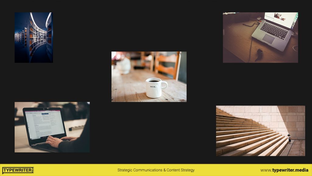
Don’t do this. If you are adding an image, preferably keep it to one image a slide. Also, add an image when needed and only when it helps accentuate the meaning of what you are conveying.
4. Weird colours
Another mistake I have seen people make is adding bright colours for the sake of showing off their presentation as “vibrant”.
At times it might be white text on a yellow background, pink text on an orange background, and so on.
Please do not resort to such crimes on humanity. If doubtful about which colours to use, refer to this amazing article by Canva which can help you in making sensible colour decisions.
5. Animations
Animations in presentation design are very 2005.
Fade, wipe, fall over, flash, page curl, checkerboard, bounce and whatnot. The list is endless.
In an era when we talk about simplicity, the best design is no design. Try to do away with animations unless they absolutely, positively, definitely add some value.
Like I say- Bouncing is for balls. Not for texts.
Conclusion
To summarize the content, we primarily focused on three areas of presentation design – key aspects, design styles and mistakes to avoid.
And under each, the topics we covered were:
- Key aspects
- Storyline
- Emotion
- Message
- Design
- Consistent
- Simple
- Design styles
- Takahashi + Lessig style
- Kawasaki 10.20.30 style
- Mistakes to avoid
- Wrong fonts
- Inconsistent formatting
- Multiple random images
- Weird colours
- Animations
I really hope that was of value. If you think there’s anything else really important that I should add, do let me know.
Ciao.
Want to join our small but awesome community? Just drop in your email below and I’ll buzz you in.
Cover Photo by Charles Deluvio on Unsplash


Thank you, excellent summary and presentation!!!
Thank You!