A lot of us have a blog nowadays. While some of us might not have too much of an issue getting visitors to read the actual content, quite a lot of us are struggling to get people to actually read what we have written after so much research and hard work. And the first step to doing that is to understand how to make your blog more readable.
As writers, a lot of us only consider what we write.
What we forget to consider is how our audience reads. What they want.
Apart from the quality of our content, what are the little things that better their experience of reading on our blog.
Based on my personal experience of blogging for almost 10 years, here are 9 easy tips to make your blog more readable.
1. Use lots of subheadings
This would be my first and foremost point.
Use a lot of H2 and H3 sub-headings in your blog post.
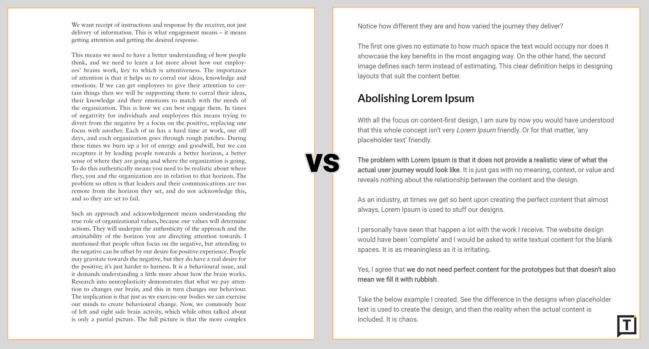
This creates sections of text instead of making your blog post seem like an academic research paper.
Also, multiple sub-headings make your content seem more organized. It gives the reader a better user experience in terms of being able to skim content, but at the same time get the gist of what you have written.
2. Break content into small(est) paragraphs
You’ll have to forget a bit of the rules of English writing that you learnt in school for this.
Break your paragraphs into the smallest length possible. Even if it means a paragraph has just one sentence.

Just take a look above (and below) of how most of my paragraphs look. Almost none of them have more than 3 sentences. This makes it easier to scan and read.
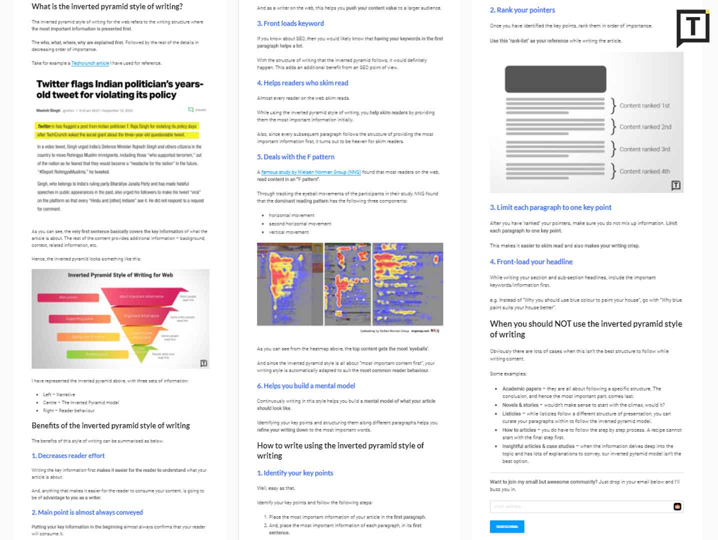
The human mind usually reads the first and last sentences of a paragraph when skim reading. But if there are only 1-2 sentences in each paragraph, then there’s a higher chance of the reader actually reading the whole thing.
3. Keep sentences short
Now that you have decided to keep your paragraphs short, let’s take it up a notch.
Make your sentences as short as possible. Use more periods (full-stops) than commas.
This helps create more white space in your presentation. And obviously helps with making your blog more readable.
4. Use bullets and lists
One of the easiest ways to write short sentences is to create bullet points.
It keeps your sentences short and crisp.
And you know how we all love reading lists as compared to normal blocks of text. No wonder listicle blog posts perform better than others.
5. Bold important words/phrases
Am pretty sure by now you know how important it is to make your content skimmable while ensuring that the reader takes away as much information as possible.
Bolding words/phrases do just that. It brings the attention of the reader to that set of word(s).
But make sure you use this ‘facility’ sparingly. If you just bold everything, loses the whole point of why actually we are doing it in the first place.
6. Break paragraphs with visuals
No matter how short or long your blog post, make sure you have a good mix of visuals included.

And by visuals, I don’t just mean images. It can be videos, GIFs, charts, tables, etc. Anything that adds to the visual element of presentation.
Your reader will definitely thank you for including something other than just a bunch of text.
7. Choose a legible font
There are reasons why we don’t write documents in comic sans or jokerman.
The readability comes down to zero. And you also make sure that the reader never comes to your blog ever again.
Going for a fancy font is a very novice mistake. When in doubt, just go with the default font your CMS provides. Or just go with decent web font.
8. Keep your language simple
Unless you are out to write Shakespearean literature, it is better to stick to the simplest of words.
Irrespective of how educated your target audience might be, writing in plain language is the easiest to read.
This way, not only are you opening up your writing to a larger audience, but you are also making sure that the existing audience has an easy journey while reading your content.
9. Consider good contrast
Almost always go with dark grey text on white background.
Anything else, just say no to. Even white text on black background is strenuous to the eyes.
And in the name of going fancy, please never go yellow text on purple background or something equally crazy!
Want to join my small but awesome community? Just drop in your email below and I’ll buzz you in.
Photo by Paul Hanaoka on Unsplash
Technology vector created by freepik - www.freepik.com


