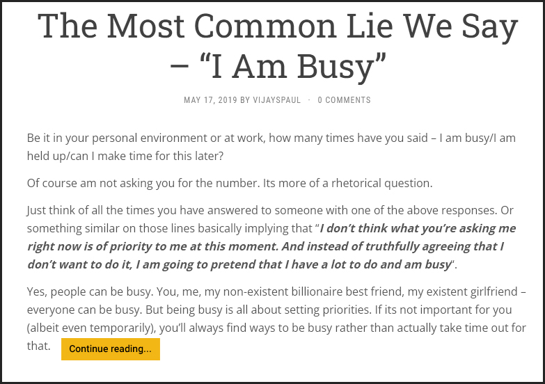
Take a look at this webpage below. There are five links. Can you identify them all?

There is a high chance that the first link you saw was the orange coloured ‘continue reading’ link at the bottom. Absolutely as intended.
But where are the other four links?
If you are even remotely familiar with blogs, you’d say the title of the article is the second link that opens up to the blog post. Even though it’s not easily understandable due to lack of any visual cues, that’s what convention states. And yes, you would be absolutely right at that too.
And what about the other three links?
If you spotted them, then you are definitely used to spending a lot of time online, reading blogs and news articles. If not, nothing wrong in that either.
This is where the difference between intuitive vs acquired behaviour becomes evident.
The third link is the date of publication, which also takes you to the page of the blog post. Of no special benefit to the user, but programmed in so by the developers.
In most cases, you wouldn’t know this unless you are a web developer yourself. Or like me, spend half of your awake time reading blogs.
The fourth link is the author name, which by convention takes you to an archive of articles written by the author. Makes sense once you’re familiar with the fact that the author name in blog posts or news articles is almost always linked like this.
The fifth link here, is actually the comments for the blog post — 0 comments, in this case. Another one of web developers’ antics, this link usually takes you to the comment section at the bottom of the blog post. Well, at least that’s what happens in the web page this screenshot is from. In some others, I have noticed that this just takes you to blog post itself, and you have to manually scroll to the comment section.
What do we notice here?
We effectively have four links pointing to the same page, and one archive link.
The “Continue reading…” link is logical and intuitive. Even if someone is using a website for the first time, it is clear what would happen if they click on the button.
But the other four links are not so. To know that they are links, and where they would probably lead to, you’d need to have been fairly familiar with navigating web pages. It is not intuitive at the get go.
And while you might be more used to clicking on the title of the article to go the corresponding web page, it is a behaviour you have acquired through your continuous web usage.
Intuitive behaviour is logical and needs no prior training/experience. Acquired behaviour is something you have learnt through experience.
You might wonder why there’s double linking (or quadruple in this case) to the web page, including a link that explicitly states the action. The answer is simple — it caters to two different audiences/users. One with previous experience, and one without.
Why is understanding intuitive vs acquired behaviour important?
Irrespective of who you are — a business owner, a UI designer, a working professional, or a doctor, etc; understanding the difference between these two behaviours is important.
- As a business owner, you might have products/services delivered to new customers as well as recurring customers.
- As a UI designer, you might need to design interfaces that are comfortable for both new users, as well as for regular users.
- As a working professional, you might have to create work systems/processes that are easily understood by a new intern, as well as by someone who’s been working in the organization for 10+ years.
- As a doctor, you might have to convey medical advice to someone who has been diagnosed with an ailment for the first time, as well as to someone who’s been a chronic patient.
No matter who you are or what you do, you’ll always interact with people/ users/ customers/ where you have to be conscious of their behaviour — whether it is intuitive or acquired. And the better understanding you have of this, the better you’ll be able to provide them solutions.
I invite you to join my small but awesome community. Just drop in your email below and I’ll regularly send you awesome content.
Inspired from the UX Foundations LinkedIn Learning Course by Morten Rand-Hendriksen
Photo by Karsten Winegeart on Unsplash


